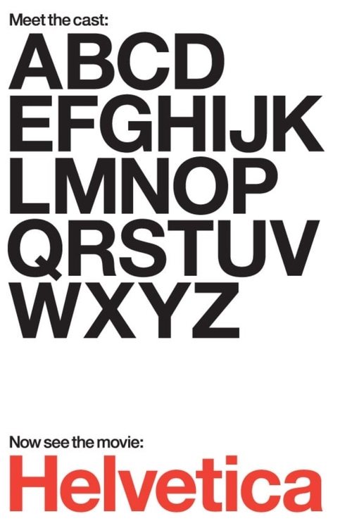
Helvetica
Typography, Graphic Design and Global Visual Culture
Directed by Gary Hustwit
Produced by Swiss Dots, Veer
A thoughtful, visually engaging documentary that explores how a single typeface shapes urban visual culture and invites reflection on design's invisible influence on daily life.
Helvetica is a feature-length independent film about typography, graphic design and global visual culture. It looks at the proliferation of one typeface (which will celebrate its 50th birthday in 2007) as part of a larger conversation about the way type affects our lives. The film is an exploration of urban spaces in major cities and the type that inhabits them, and a fluid discussion with renowned designers about their work, the creative process, and the choices and aesthetics behind their use of type.
Clusters
Genres
Questions people ask
Is Helvetica scary? No. Less frightening than 98% of films.
Is Helvetica violent? No. Less violent than 92% of films.
Is Helvetica sad? Barely. Less sad than 80% of films.
Is Helvetica easy watching? Yes. More comforting than 77% of films.
Does Helvetica end with hope? About average. Almost exactly mid-range.
These describe how the film comes across, measured across the whole film and compared with other well-known films. They are not a content list — nothing here was counted or checked scene by scene, so for age-suitability or specific content use a classification board or a dedicated content-warning service.
Cinnamon Score
How much this film gives you that nothing else will, and whether it delivers.
Distinctly its own thing.
How unlike any other film this one feels
How much more it delivers than it promises
How much audiences actually like it
Ensemble
Like Helvetica
Nearest across the full emotional profile.

Same Mood as Helvetica
Nearest on what's most distinctive about this one.



Like Helvetica, But Darker
Similar, pushed toward heavier and more intense.


Like Helvetica, But Lighter
Similar, pushed toward warmer and easier.
Like Helvetica, But Less Popular
Same territory, far fewer people have seen it.